Custom CRM design

for restaurant operations management

Custom CRM design

for restaurant operations management

We helped restaurant staff process orders faster and more easily by improving navigation and information layout in the CRM system - right within their daily workflow.

We helped restaurant staff process orders faster and more easily by improving navigation and information layout in the CRM system - right within their daily workflow.

The Challenge

The restaurant approached our team with a concern: their current CRM system was cluttered, lacked visual hierarchy, didn’t align with their brand aesthetics, and caused difficulties for both experienced and new staff.

The restaurant approached our team with a concern: their current CRM system was cluttered, lacked visual hierarchy, didn’t align with their brand aesthetics, and caused difficulties for both experienced and new staff.

What objectives were set?
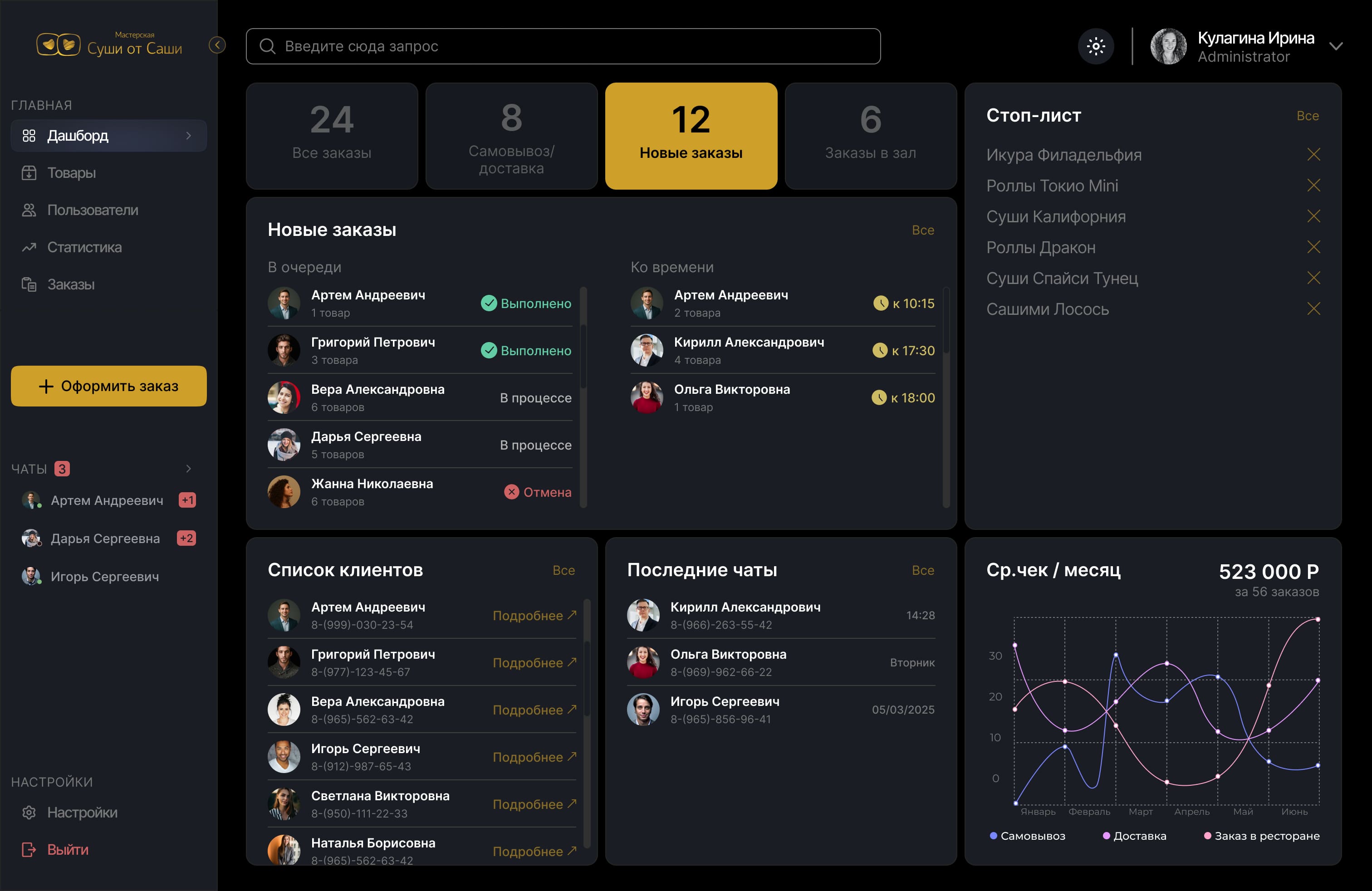
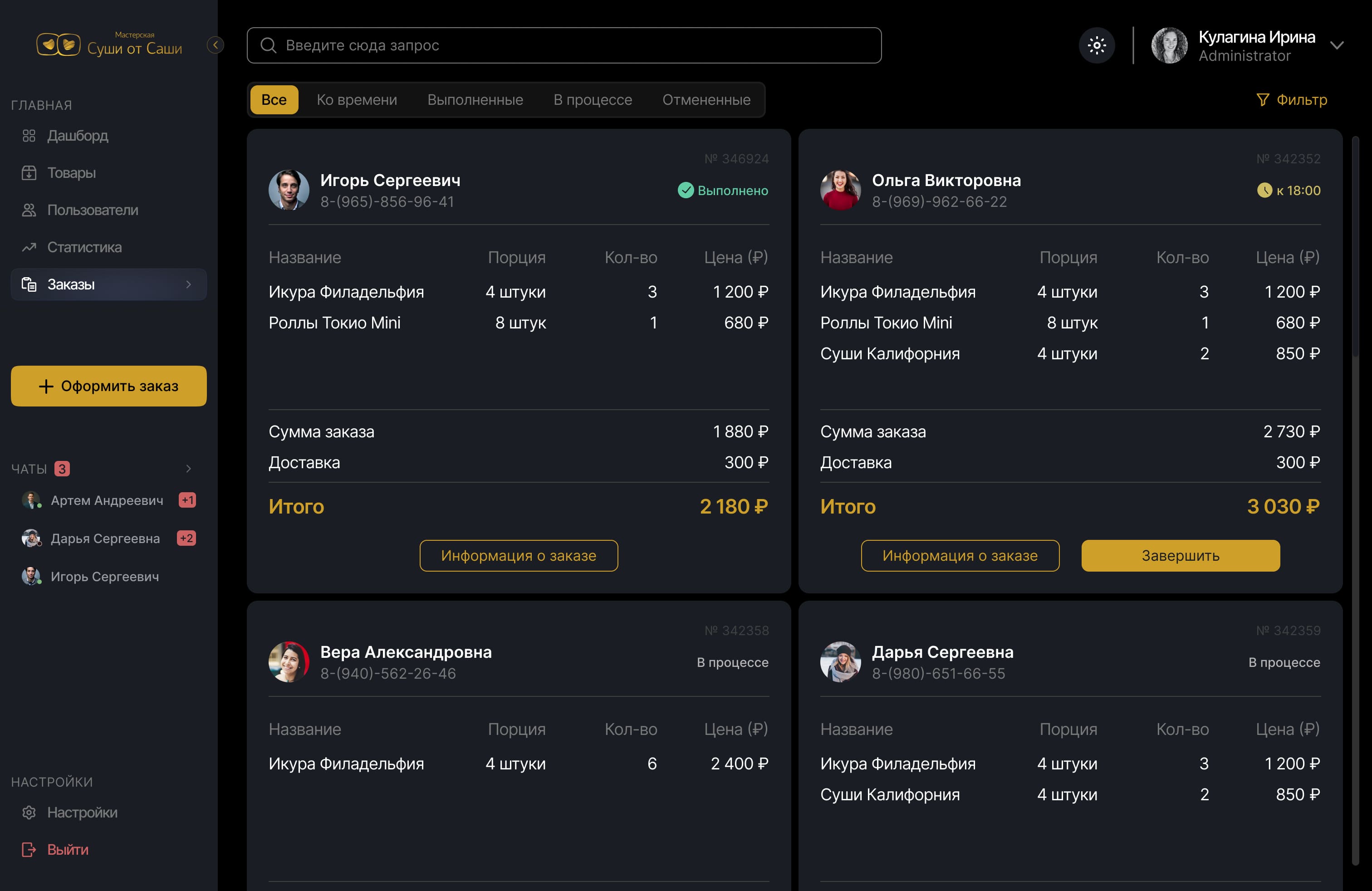
• Improve staff efficiency and interface usability

• Align the design with the restaurant's brand style

• Create both light and dark themes for diverse usage conditions

• Enhance readability and prioritize key data

• Simplify onboarding for new employees

• Improve staff efficiency and interface usability

• Align the design with the restaurant's brand style

• Create both light and dark themes for diverse usage conditions

• Enhance readability and prioritize key data

• Simplify onboarding for new employees

Old Version

My Role

UX/UI designer on the project. Improved interface structure, readability, and accessibility. Designed both light and dark themes to support different working conditions. Removed non-essential elements, optimized key user flows, and applied staff feedback to enhance usability.

UX/UI designer on the project. Improved interface structure, readability, and accessibility. Designed both light and dark themes to support different working conditions. Removed non-essential elements, optimized key user flows, and applied staff feedback to enhance usability.

Understanding First

We started with an interface audit and on-site observations. Staff interviews revealed recurring frustrations: hard-to-locate info, unclear order statuses, and distracting visual clutter
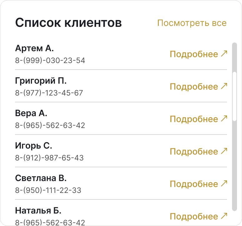
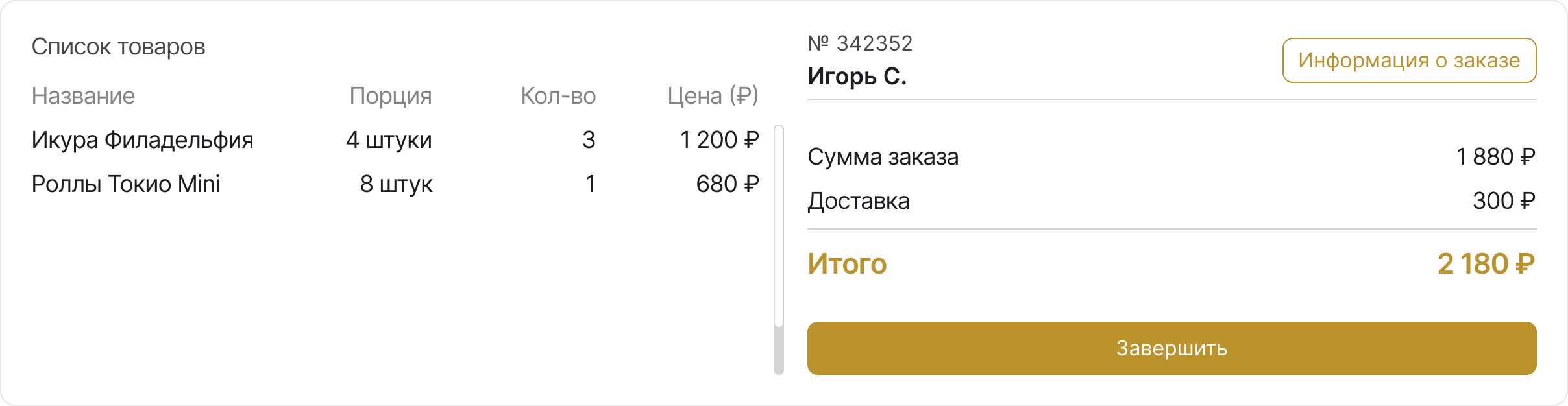
New Elements

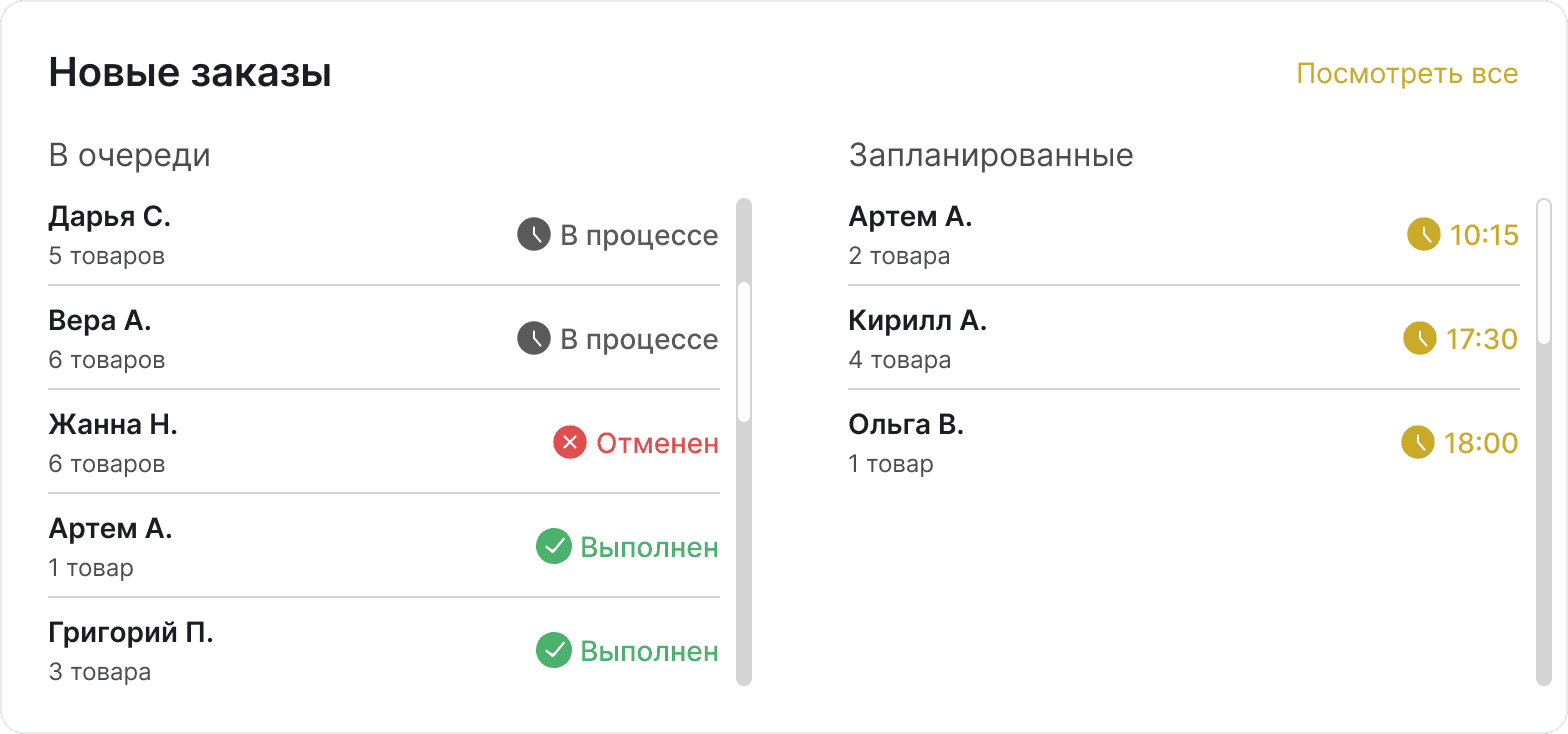
We tested the interface in real shifts

1

Measured how quickly staff navigated the system

Measured how quickly staff navigated the system

2

Compared task completion speed before and after redesign

Compared task completion speed before and after redesign

3

Collected feedback and identified friction points

Collected feedback and identified friction points

Reorganized screen layout based on task priority, added support for both light and dark themes, visual style matched the restaurant’s interior and identity

Reorganized screen layout based on task priority, added support for both light and dark themes, visual style matched the restaurant’s interior and identity

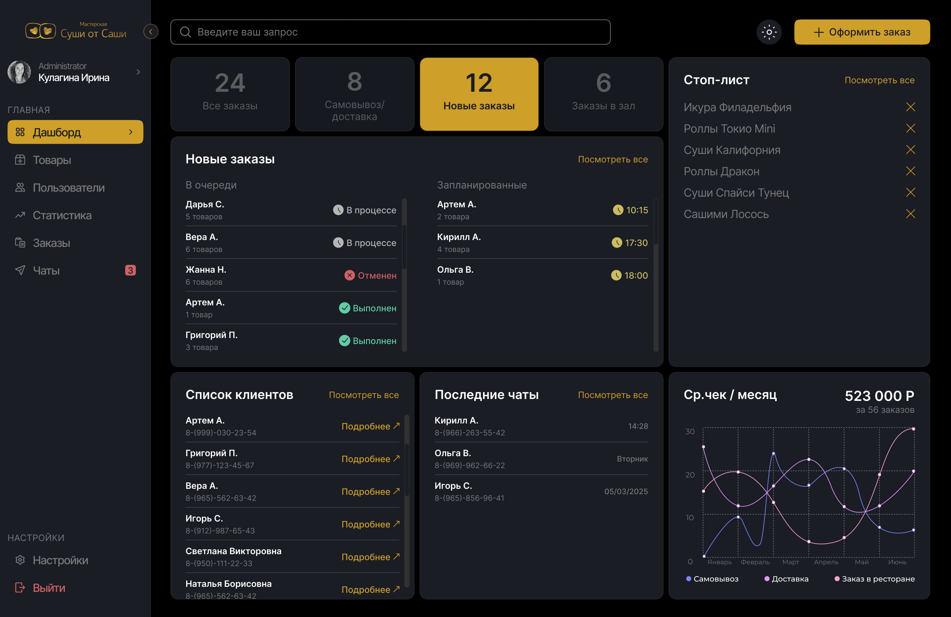
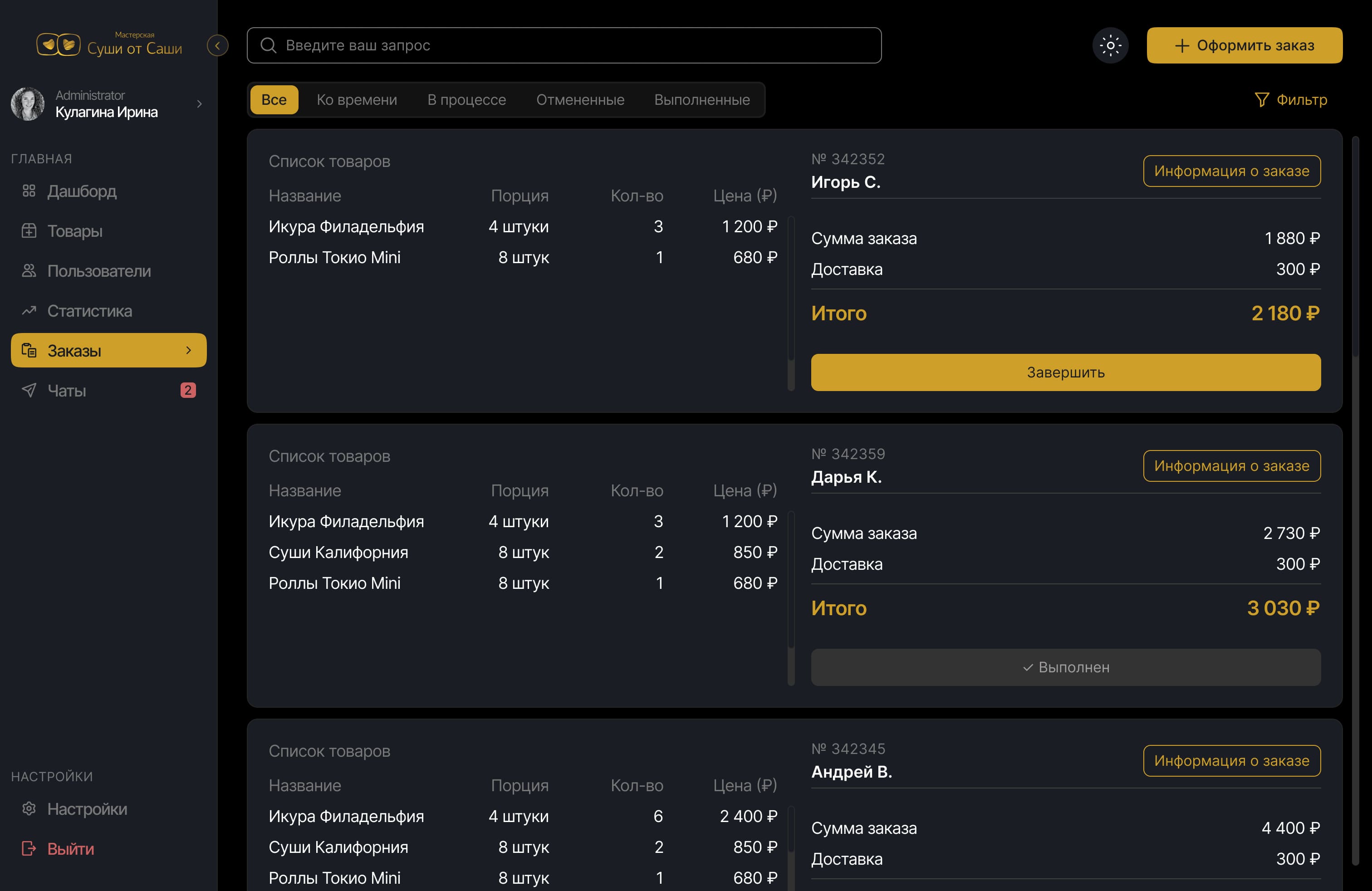
Before and After: Streamlined Interface for Focus and Efficiency

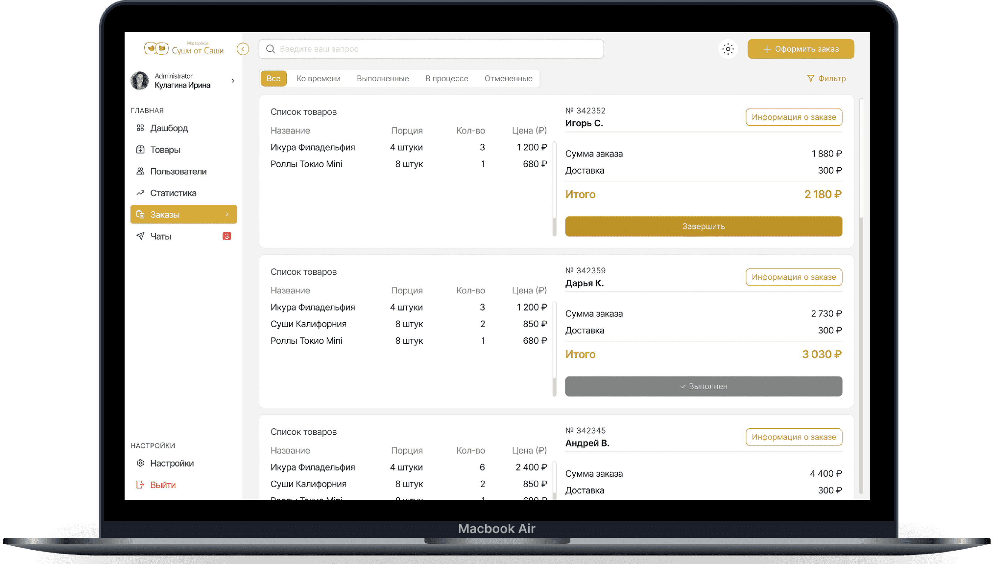
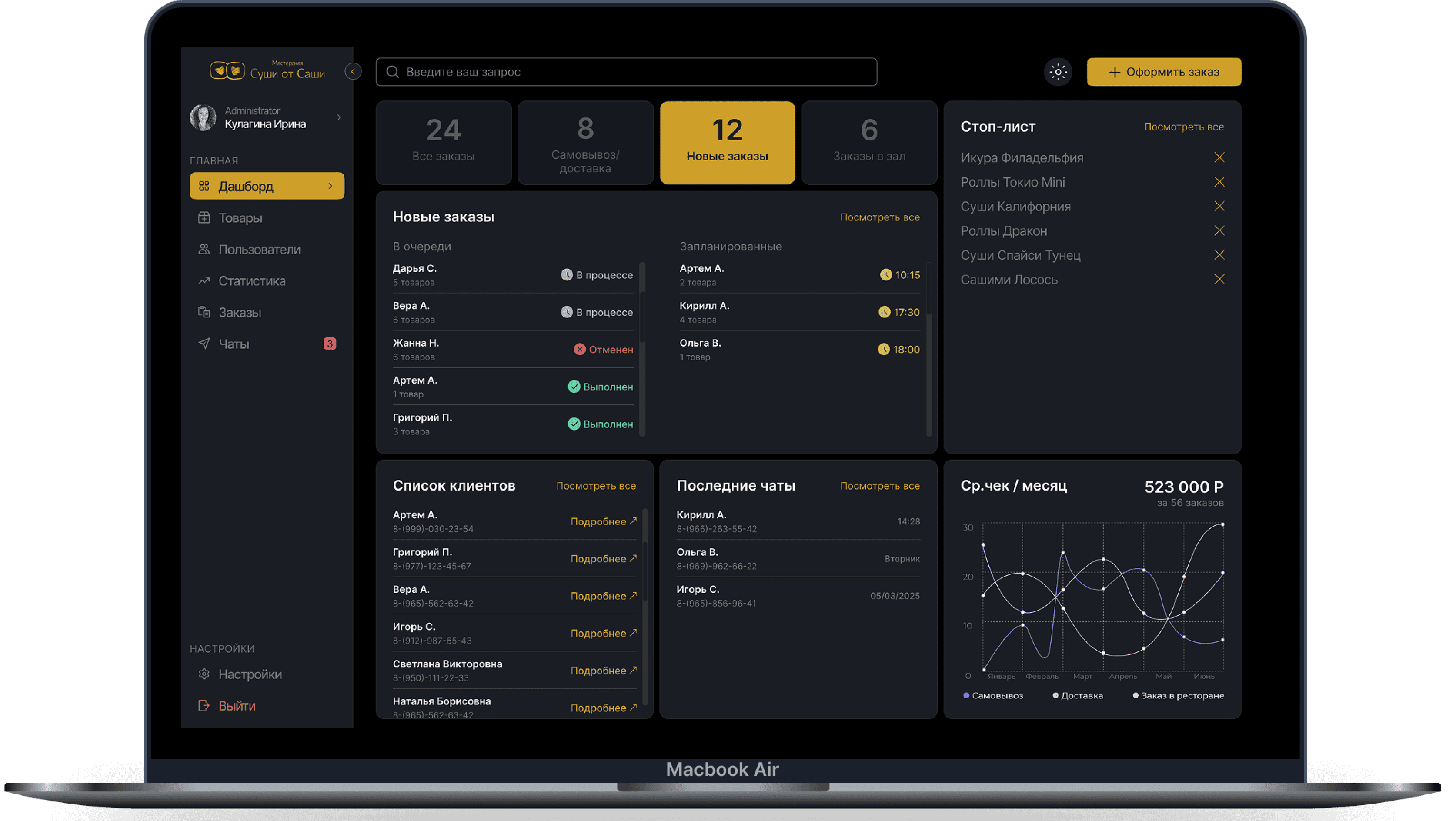
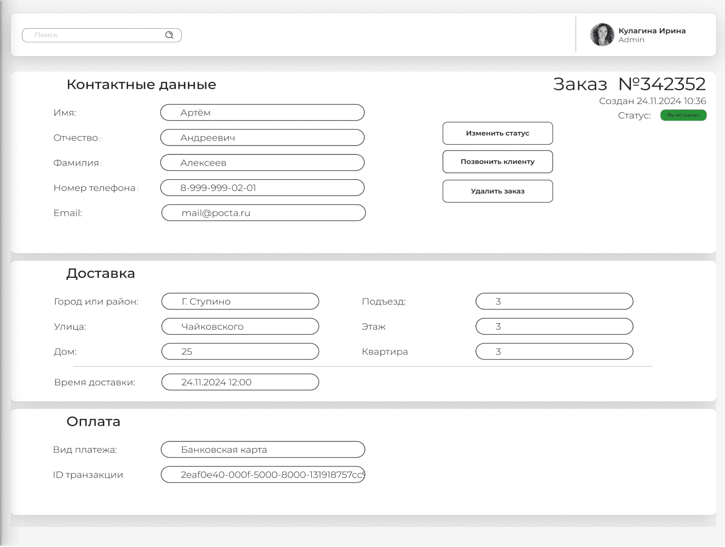
We analyzed real-world usage and simplified the interface to remove distractions and prioritize essential information. Customer photos were removed as they weren’t used and created noise. Name fields, often left empty, are now hidden by default. Key order data - status, total, and table number - was visually prioritized for faster scanning. The side menu was cleaned up by removing rarely used chat links and placing quick order creation more accessibly. The order card was completely redesigned with a clear layout emphasizing the product list. These updates improved clarity and helped new staff get up to speed from day one.
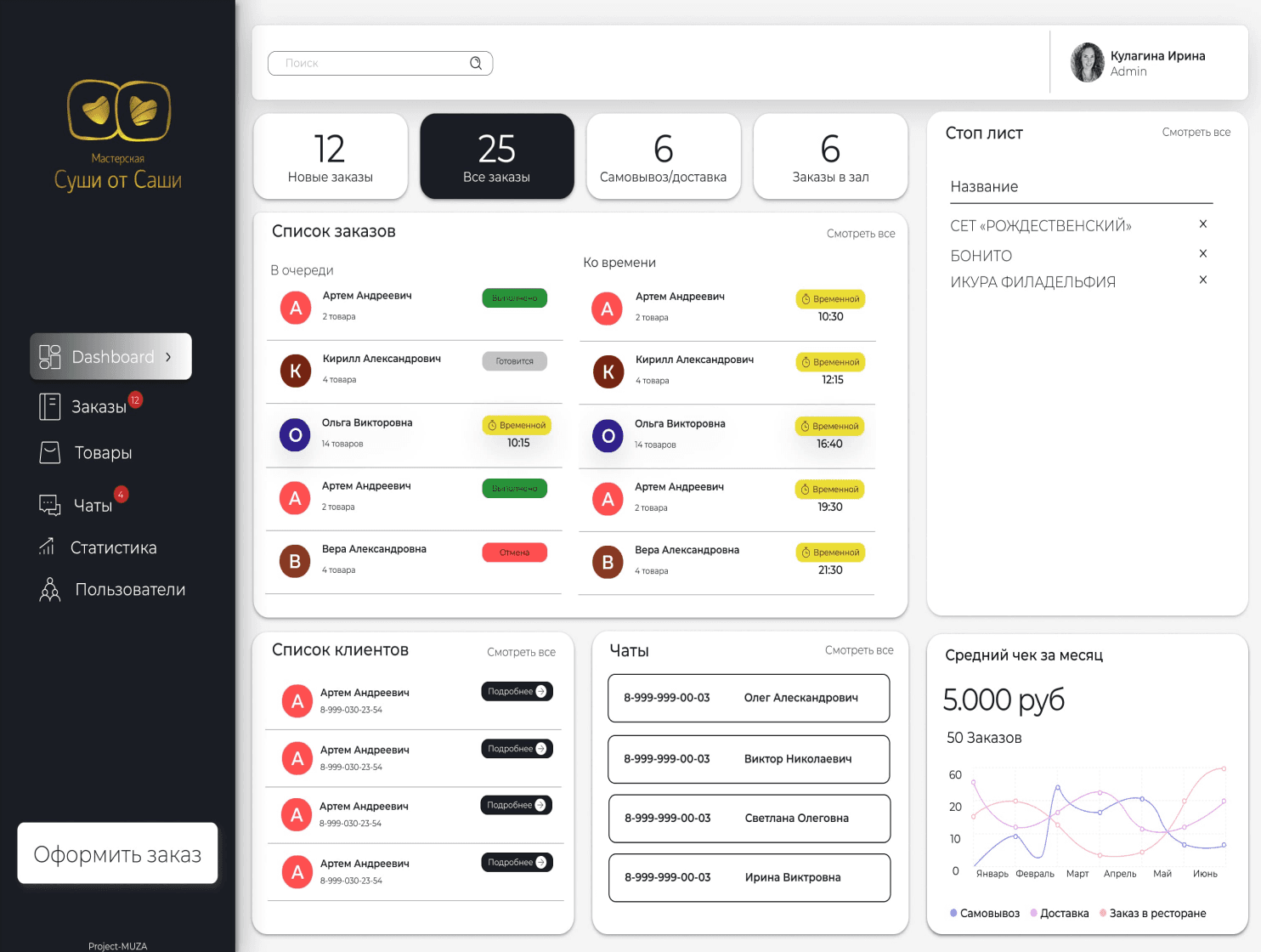
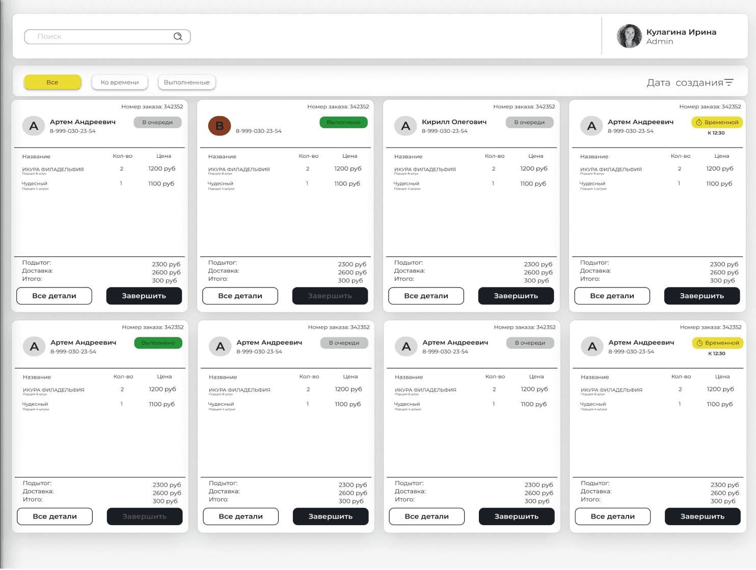
Before

After

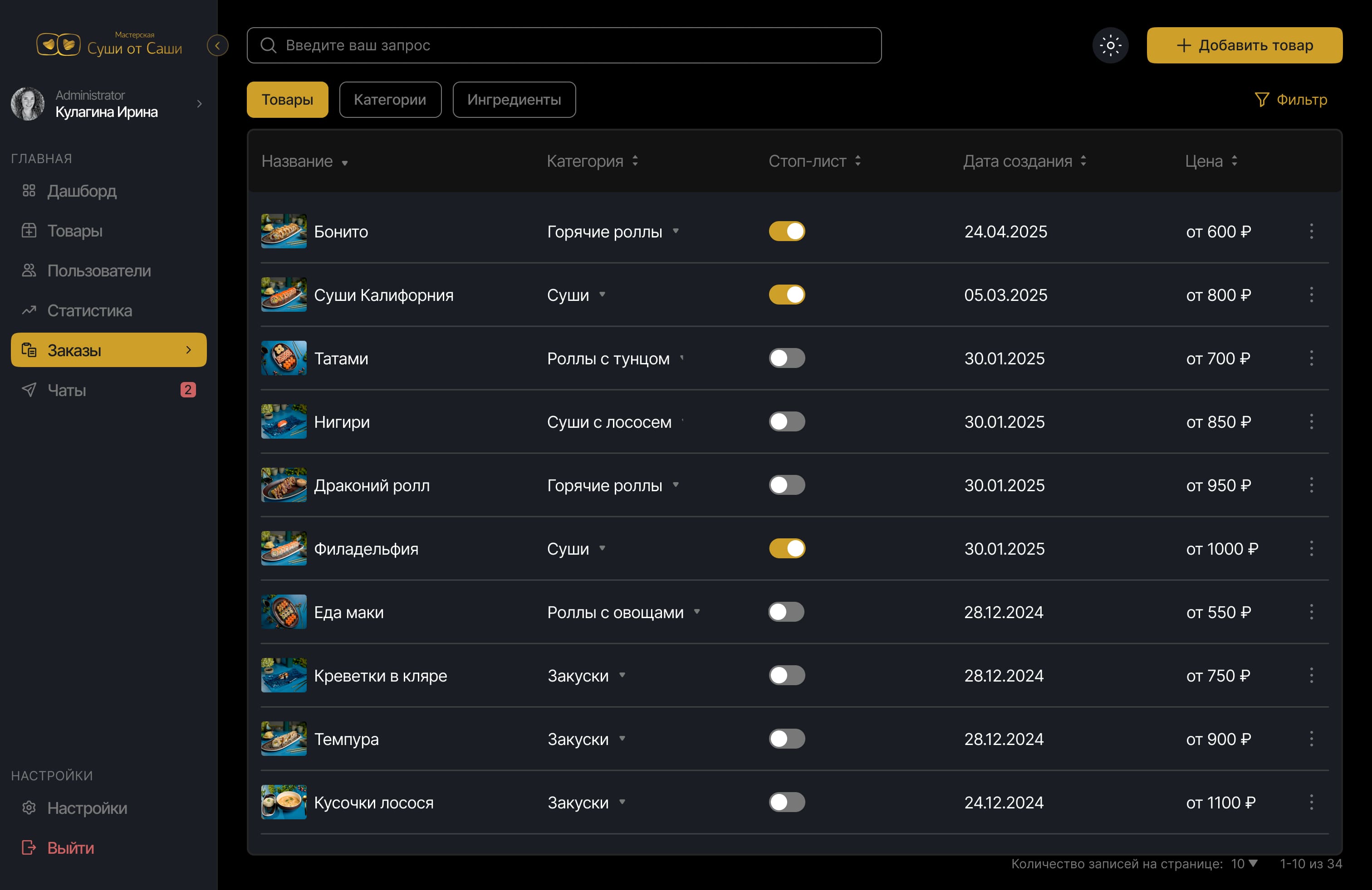
Effortless Product Control

Redesigned product interface for fast item, category, and ingredient management. Added toggle to stop-list items instantly. Clean navigation ensures quick updates during busy hours.

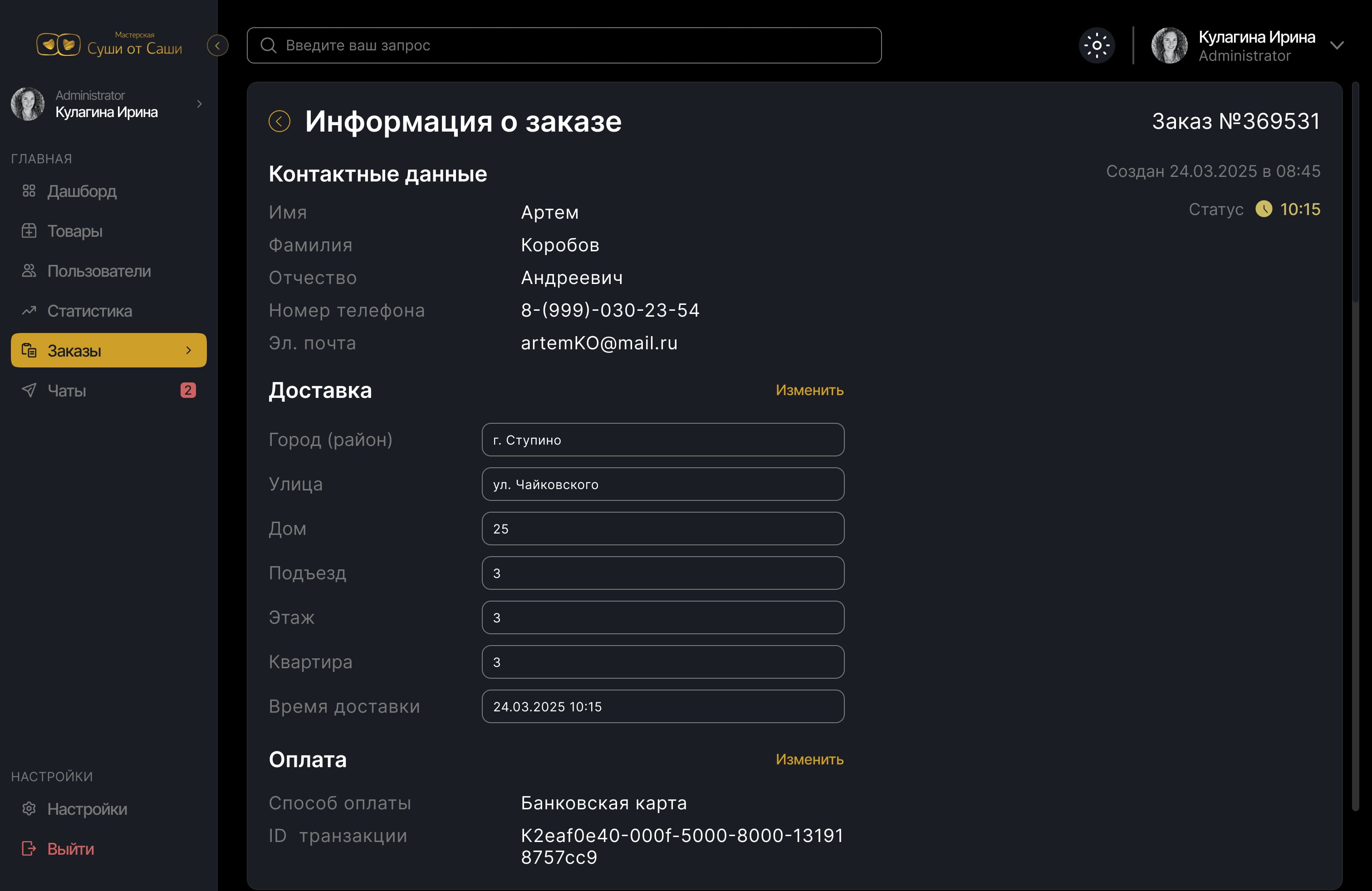
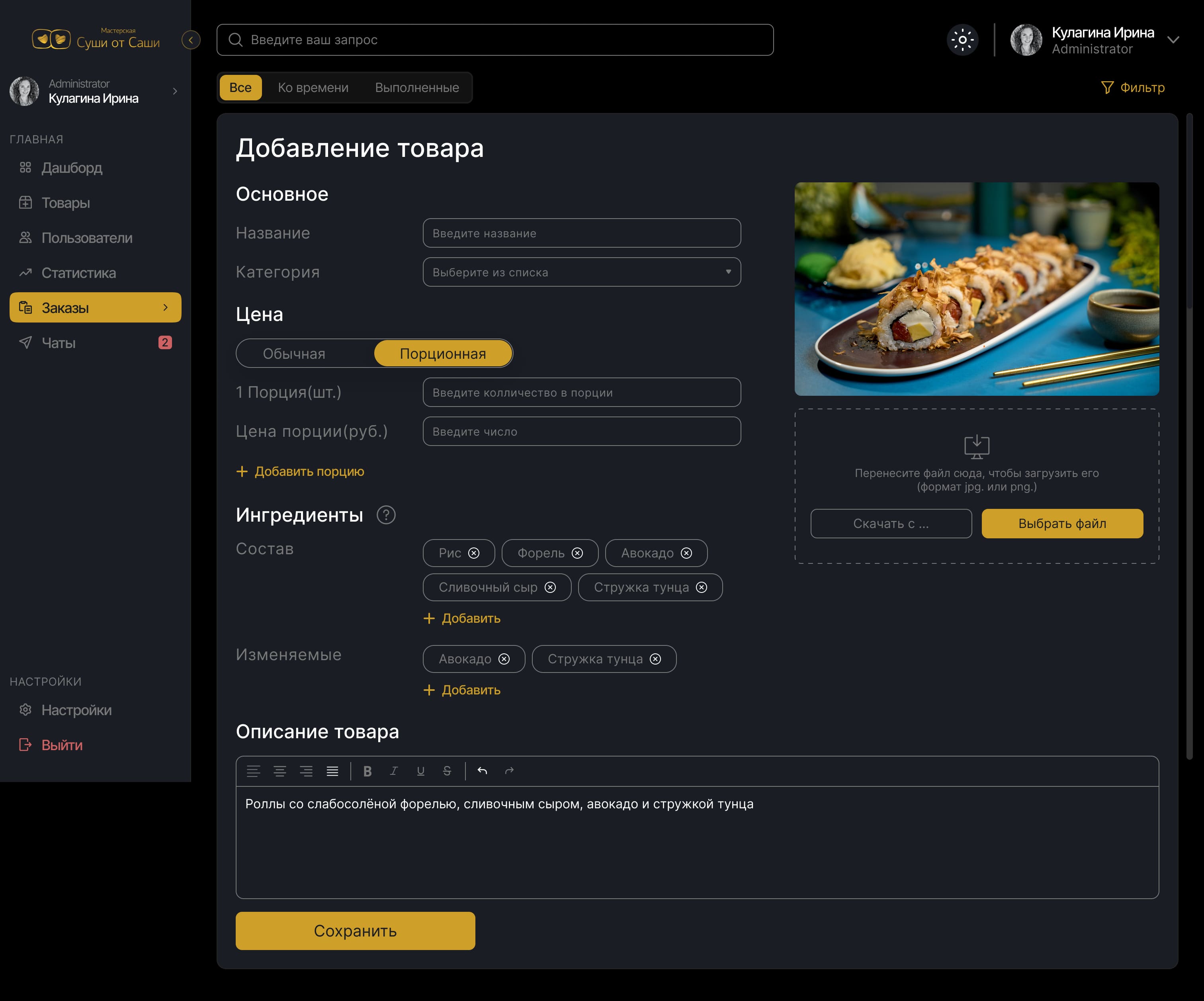
Unified Interaction Design

A consistent system for adding, viewing, and managing data across products and orders. Clean input fields, logical layout, and clear visual hierarchy ensure speed and confidence in daily tasks. Even new team members can quickly navigate the interface without training.

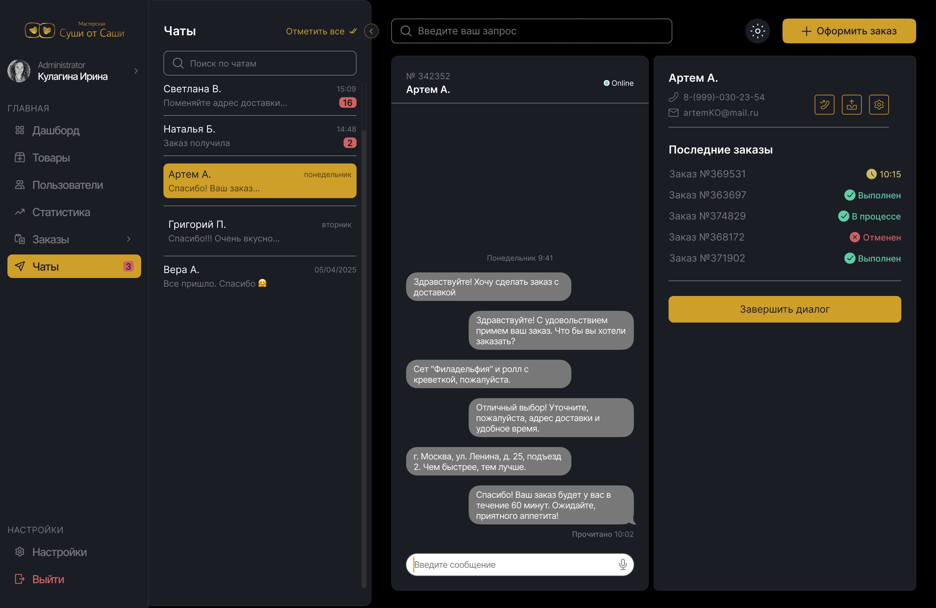
Streamlined Communication Hub

A two-level chat interface that lets staff handle conversations and access key client data without switching screens. Previous and current orders are shown alongside the chat, with quick access to alternative contact methods in case of issues - all in one clean, organized view.

Measurable Results

30%

reduction in client-related errors through simplified interface and data clarity

80%

positive feedback from managers and kitchen staff after full rollout

1-2 shifts

for full onboarding instead of 3–4 - cutting training time by 50%

60%

faster order processing due to improved order card structure and navigation